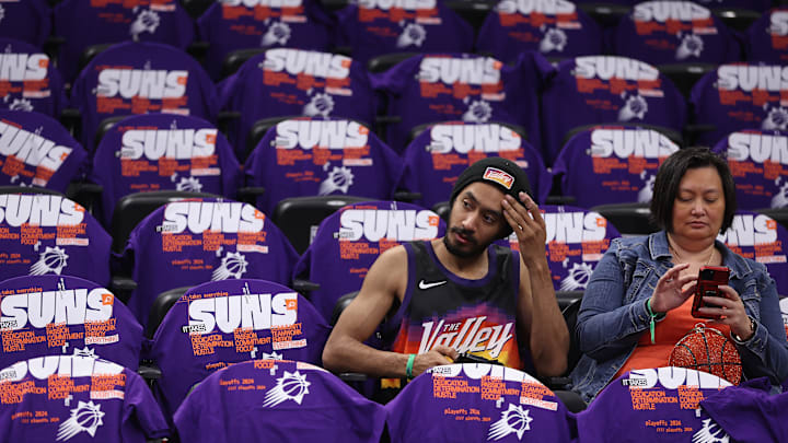
If there is one thing the Phoenix Suns have done really well throughout their history, it is the wearing of iconic threads to go with that memorable purple of The Valley. From everybody's favorite retro jersey of the early 90s - forever linked with Charles Barkley and that run to the NBA Finals - to the kits worn by Steve Nash, there's plenty to look back on and like.
The Suns haven't always hit the mark though, who could forget these bad boys that unsurprisingly you can currently find to buy online. To be fair to the Suns though, that whole sleeved jerseys era of the league is best forgotten, and they were only trying to make do with what the NBA told them they had to do.
As for this year's City Edition jersey though, well that's on them.
As of now this is only rumored to be the threads the team will be wearing next season - and you can check it out here - but more often than not these leaks prove to be correct. If this is to be the jersey the Suns will be wearing as they bid to win a first ever championship, it has certainly split opinion amongst the fanbase.
From our own perspective, this feels like something the Suns' new G League affiliate - the Valley Suns - would suit up in, with the "Valley" across the front really hammering that point home. Obviously Phoenix is the valley of the sun, but the jersey seems to lack the pop that is so easy to accomplish with the color scheme the Suns have. It makes this jersey from the Chris Paul era look like a classic.
.@Suns debut their new City Edition jerseys 🔥 pic.twitter.com/7yb2kfDfDi
— Bleacher Report (@BleacherReport) November 12, 2020
The organization are clearly trying to send up the 1995 All-Star game - on what is the 30th anniversary of the exhibition game being held in Phoenix - with the layout of the jersey, and you have to commend them for that. But tackling what is perhaps the greatest All-Star game in history is a tough task, and it requires really going for it to try and capture that 90s look and feel.
What the Suns have made instead is just a very meh attempt at this. It's not bad and it's sure to be worn plenty in the Footprint Center this coming season, it just could have been so much more. On a positive note though the color is nice, and leaning into that purple goes down as a win for the franchise here.
The other glaring issue is with the font used to spell out "Valley", which has a very Texan feel to it. Like something you'd see on a San Antonio Spurs jersey, which is not what Suns fans want to be associated with. Yes Arizona is certainly the Wild West in its own way, but it just doesn't feel right seeing it used as the font here.
As long as the team can be successful in these jerseys then fans aren't going to care, and its not like you're being forced to buy it either. But with a rich history, clear links to a beloved All-Star jersey from the past and a color scheme that plenty of rival franchises would love to have and be able to use - if this is to be the City Edition jersey for 2024-25 - it just feels a bit flat.
