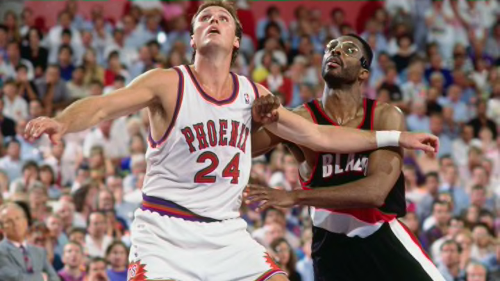
11. Icon Purple

These new jerseys are hot. I seriously cannot get over how much better they look than the prior set. What specifically makes these so nice is that while the last set tried to put a spin on the 90’s uni’s, in my opinion they failed miserably. These put a spin on the original set and do a much better job of staying true to the original look while still creating it’s own original identity.
Often less is more in fashion, and truly these uniforms look great because they do not try to do too much. The name across the chest as well as the number are straightforward with nothing more than a little funk in the font. The color set look far more like the deep purple and bright orange that Suns fans love to see, while the added flair of the stripes down the side are a nice touch, and much less obtrusive than the solid bars of secondary color in the Nash-era tops and shorts.
This is a great look for the future, and hopefully the uniform the Suns are wearing when they FINALLY climb to the top of the NBA mountain.
