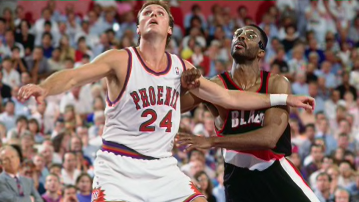
17. Nash-era Purple


Even though three of the four jerseys from this hear are way down on this list, they do ooze with nostalgia as they came one year after the onset of “Backcourt 2000” and were, at least at their original release, pretty neat.
Obviously from the time they were released to when Grant Hill wore them, the uniforms went through a bit of change, the two biggest being the material (I think the Kidd-era fabric actually made the colors pop better), and the font obviously shrunk significantly. On the Kidd jerseys, the player numbers were also on the sides of the shorts, whereas the later incarnation placed a fireball there.
The brilliant color of these pictures honestly does help the look of this jerseys a little. I could have found a more dull photo, especially of the newer unis, but wanted to try and at least present this road purple at it’s finest, even though it is still one of the worst.
Overall the font in “PHOENIX” and in the numbers are bland. The name ended up tiny, especially when compared to the giant numbers, and the digits too were awkwardly placed inside of an oval to help tie the look together. That oval looks alright with a two digit number, but more out of place with a single digit.
At least the purple doesn’t look as bad with the grey as the orange, although I have always wondered if they would look better with orange instead of grey paneling – and if the orange jerseys looked better with purple instead of grey as well.
