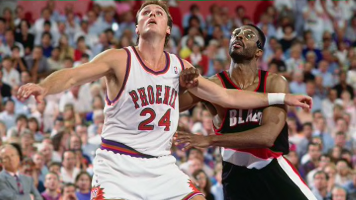
22. PHOENIX Grey

This jersey has so many problems, we’re lucky that this isn’t another one of those “Los” jerseys that would have made this even worse.
For starters, and most importantly, it is grey. Grey was already a mistaken secondary color on the Nash-era uniforms, but to then make it the primary color on a uni and supplement it with black and a hint of orange is just God-awful. Not to mention that it had sleeves, which seriously looks silly on a basketball jersey.
To top it off, the symmetry looks funny too as “PHOENIX” appears to be very small compared to the width of the jerseys. This might be really nit-picking, but there seriously should at least have been a black belt across the waste to break up the look of dirt-pan dust.
